
Lesson guide
Learning objectives
- Explain the main purpose of JavaScript animations in JavaScript.
- Identify the syntax, APIs, or concepts introduced in this lesson.
- Use the examples to predict how JavaScript will behave before you run similar code.
- Connect this topic to nearby lessons in Animation.
Real-world context
This lesson matters when you need to recognize where JavaScript animations fits into real JavaScript programs. JavaScript animations can handle things that CSS can’t.
Key ideas
- JavaScript animations is part of the Animation chapter, so it builds on the surrounding concepts rather than standing alone.
- Read each code example in two passes: first for the result, then for the rule that explains the result.
- When a section compares similar features, focus on the condition that makes you choose one feature over another.
Key terms
- JavaScript animations
- JavaScript
- animations
- Animation
JavaScript animations can handle things that CSS can’t.
For instance, moving along a complex path, with a timing function different from Bezier curves, or an animation on a canvas.
Using setInterval
An animation can be implemented as a sequence of frames – usually small changes to HTML/CSS properties.
For instance, changing style.left from 0px to 100px moves the element. And if we increase it in setInterval, changing by 2px with a tiny delay, like 50 times per second, then it looks smooth. That’s the same principle as in the cinema: 24 frames per second is enough to make it look smooth.
The pseudo-code can look like this:
let timer = setInterval(function() {
  if (animation complete) clearInterval(timer);
  else increase style.left by 2px
}, 20); // change by 2px every 20ms, about 50 frames per second
More complete example of the animation:
let start = Date.now(); // remember start time

let timer = setInterval(function() {
  // how much time passed from the start?
  let timePassed = Date.now() - start;

  if (timePassed >= 2000) {
    clearInterval(timer); // finish the animation after 2 seconds
    return;
  }

  // draw the animation at the moment timePassed
  draw(timePassed);

}, 20);

// as timePassed goes from 0 to 2000
// left gets values from 0px to 400px
function draw(timePassed) {
  train.style.left = timePassed / 5 + 'px';
}
Click for the demo:
Result
index.html
open in a new windowedit in the sandbox

<!DOCTYPE HTML>
<html>

<head>
  <style>
    #train {
      position: relative;
      cursor: pointer;
    }
  </style>
</head>

<body>

  <img id="train" src="/assets/optimized/articles/clipart/train-3-animal-island--w760.webp">


  <script>
    train.onclick = function() {
      let start = Date.now();

      let timer = setInterval(function() {
        let timePassed = Date.now() - start;

        train.style.left = timePassed / 5 + 'px';

        if (timePassed > 2000) clearInterval(timer);

      }, 20);
    }
  </script>


</body>

</html>
Using requestAnimationFrame
Let’s imagine we have several animations running simultaneously.
If we run them separately, then even though each one has setInterval(..., 20), then the browser would have to repaint much more often than every 20ms.
That’s because they have different starting time, so “every 20ms” differs between different animations. The intervals are not aligned. So we’ll have several independent runs within 20ms.
In other words, this:
setInterval(function() {
  animate1();
  animate2();
  animate3();
}, 20)
…Is lighter than three independent calls:
setInterval(animate1, 20); // independent animations
setInterval(animate2, 20); // in different places of the script
setInterval(animate3, 20);
These several independent redraws should be grouped together, to make the redraw easier for the browser and hence load less CPU load and look smoother.
There’s one more thing to keep in mind. Sometimes CPU is overloaded, or there are other reasons to redraw less often (like when the browser tab is hidden), so we really shouldn’t run it every 20ms.
But how do we know about that in JavaScript? There’s a specification Animation timing that provides the function requestAnimationFrame. It addresses all these issues and even more.
The syntax:
let requestId = requestAnimationFrame(callback)
That schedules the callback function to run in the closest time when the browser wants to do animation.
If we do changes in elements in callback then they will be grouped together with other requestAnimationFrame callbacks and with CSS animations. So there will be one geometry recalculation and repaint instead of many.
The returned value requestId can be used to cancel the call:
// cancel the scheduled execution of callback
cancelAnimationFrame(requestId);
The callback gets one argument – the time passed from the beginning of the page load in milliseconds. This time can also be obtained by calling performance.now().
Usually callback runs very soon, unless the CPU is overloaded or the laptop battery is almost discharged, or there’s another reason.
The code below shows the time between first 10 runs for requestAnimationFrame. Usually it’s 10-20ms:
<script>
  let prev = performance.now();
  let times = 0;

  requestAnimationFrame(function measure(time) {
    document.body.insertAdjacentHTML("beforeEnd", Math.floor(time - prev) + " ");
    prev = time;

    if (times++ < 10) requestAnimationFrame(measure);
  })
</script>
Structured animation
Now we can make a more universal animation function based on requestAnimationFrame:
function animate({timing, draw, duration}) {

  let start = performance.now();

  requestAnimationFrame(function animate(time) {
    // timeFraction goes from 0 to 1
    let timeFraction = (time - start) / duration;
    if (timeFraction > 1) timeFraction = 1;

    // calculate the current animation state
    let progress = timing(timeFraction)

    draw(progress); // draw it

    if (timeFraction < 1) {
      requestAnimationFrame(animate);
    }

  });
}
Function animate accepts 3 parameters that essentially describes the animation:
duration
Total time of animation. Like, 1000.
timing(timeFraction)
Timing function, like CSS-property transition-timing-function that gets the fraction of time that passed (0 at start, 1 at the end) and returns the animation completion (like y on the Bezier curve).
For instance, a linear function means that the animation goes on uniformly with the same speed:
function linear(timeFraction) {
  return timeFraction;
}
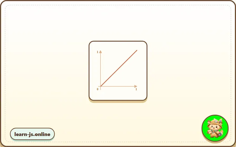
That’s just like transition-timing-function: linear. There are more interesting variants shown below.
draw(progress)
The function that takes the animation completion state and draws it. The value progress=0 denotes the beginning animation state, and progress=1 – the end state.
This is that function that actually draws out the animation.
It can move the element:
function draw(progress) {
  train.style.left = progress + 'px';
}
…Or do anything else, we can animate anything, in any way.
Let’s animate the element width from 0 to 100% using our function.
Click on the element for the demo:
Result
animate.js
index.html
open in a new windowedit in the sandbox
function animate({duration, draw, timing}) {

  let start = performance.now();

  requestAnimationFrame(function animate(time) {
    let timeFraction = (time - start) / duration;
    if (timeFraction > 1) timeFraction = 1;

    let progress = timing(timeFraction)

    draw(progress);

    if (timeFraction < 1) {
      requestAnimationFrame(animate);
    }

  });
}
<!DOCTYPE HTML>
<html>

<head>
  <meta charset="utf-8">
  <style>
    progress {
      width: 5%;
    }
  </style>
  <script src="animate.js"></script>
</head>

<body>


  <progress id="elem"></progress>

  <script>
    elem.onclick = function() {
      animate({
        duration: 1000,
        timing: function(timeFraction) {
          return timeFraction;
        },
        draw: function(progress) {
          elem.style.width = progress * 100 + '%';
        }
      });
    };
  </script>


</body>

</html>
The code for it:
animate({
  duration: 1000,
  timing(timeFraction) {
    return timeFraction;
  },
  draw(progress) {
    elem.style.width = progress * 100 + '%';
  }
});
Unlike CSS animation, we can make any timing function and any drawing function here. The timing function is not limited by Bezier curves. And draw can go beyond properties, create new elements for like fireworks animation or something.
Timing functions
We saw the simplest, linear timing function above.
Let’s see more of them. We’ll try movement animations with different timing functions to see how they work.
Power of n
If we want to speed up the animation, we can use progress in the power n.
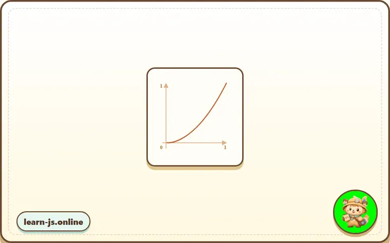
For instance, a parabolic curve:
function quad(timeFraction) {
  return Math.pow(timeFraction, 2)
}
The graph:
See in action (click to activate):
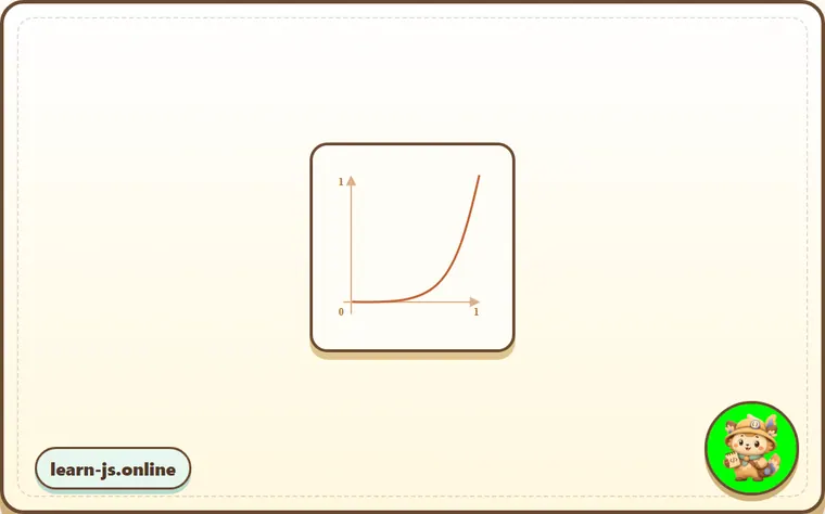
…Or the cubic curve or even greater n. Increasing the power makes it speed up faster.
Here’s the graph for progress in the power 5:
In action:
The arc
Function:
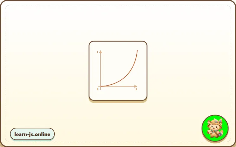
function circ(timeFraction) {
  return 1 - Math.sin(Math.acos(timeFraction));
}
The graph:
Back: bow shooting
This function does the “bow shooting”. First we “pull the bowstring”, and then “shoot”.
Unlike previous functions, it depends on an additional parameter x, the “elasticity coefficient”. The distance of “bowstring pulling” is defined by it.
The code:
function back(x, timeFraction) {
  return Math.pow(timeFraction, 2) * ((x + 1) * timeFraction - x)
}
The graph for x = 1.5:
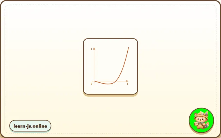
For animation we use it with a specific value of x. Example for x = 1.5:
Bounce
Imagine we are dropping a ball. It falls down, then bounces back a few times and stops.
The bounce function does the same, but in the reverse order: “bouncing” starts immediately. It uses few special coefficients for that:
function bounce(timeFraction) {
  for (let a = 0, b = 1; 1; a += b, b /= 2) {
    if (timeFraction >= (7 - 4 * a) / 11) {
      return -Math.pow((11 - 6 * a - 11 * timeFraction) / 4, 2) + Math.pow(b, 2)
    }
  }
}
In action:
Elastic animation
One more “elastic” function that accepts an additional parameter x for the “initial range”.
function elastic(x, timeFraction) {
  return Math.pow(2, 10 * (timeFraction - 1)) * Math.cos(20 * Math.PI * x / 3 * timeFraction)
}
x=1.5: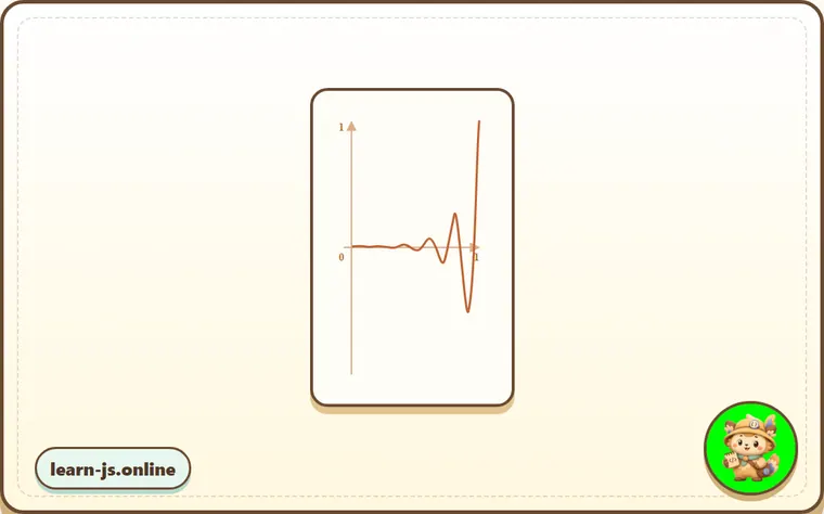
In action for x=1.5:
Reversal: ease*
So we have a collection of timing functions. Their direct application is called “easeIn”.
Sometimes we need to show the animation in the reverse order. That’s done with the “easeOut” transform.
easeOut
In the “easeOut” mode the timing function is put into a wrapper timingEaseOut:
timingEaseOut(timeFraction) = 1 - timing(1 - timeFraction)
In other words, we have a “transform” function makeEaseOut that takes a “regular” timing function and returns the wrapper around it:
// accepts a timing function, returns the transformed variant
function makeEaseOut(timing) {
  return function(timeFraction) {
    return 1 - timing(1 - timeFraction);
  }
}
For instance, we can take the bounce function described above and apply it:
let bounceEaseOut = makeEaseOut(bounce);
Then the bounce will be not in the beginning, but at the end of the animation. Looks even better:
Result
style.css
index.html
open in a new windowedit in the sandbox
#brick {
  width: 40px;
  height: 20px;
  background: #EE6B47;
  position: relative;
  cursor: pointer;
}

#path {
  outline: 1px solid #E8C48E;
  width: 540px;
  height: 20px;
}
<!DOCTYPE HTML>
<html>

<head>
  <meta charset="utf-8">
  <link rel="stylesheet" href="style.css">
  <script src="https://js.cx/libs/animate.js"></script>
</head>

<body>


  <div id="path">
    <div id="brick"></div>
  </div>

  <script>
    function makeEaseOut(timing) {
      return function(timeFraction) {
        return 1 - timing(1 - timeFraction);
      }
    }

    function bounce(timeFraction) {
      for (let a = 0, b = 1; 1; a += b, b /= 2) {
        if (timeFraction >= (7 - 4 * a) / 11) {
          return -Math.pow((11 - 6 * a - 11 * timeFraction) / 4, 2) + Math.pow(b, 2)
        }
      }
    }

    let bounceEaseOut = makeEaseOut(bounce);

    brick.onclick = function() {
      animate({
        duration: 3000,
        timing: bounceEaseOut,
        draw: function(progress) {
          brick.style.left = progress * 500 + 'px';
        }
      });
    };
  </script>


</body>

</html>
Here we can see how the transform changes the behavior of the function:
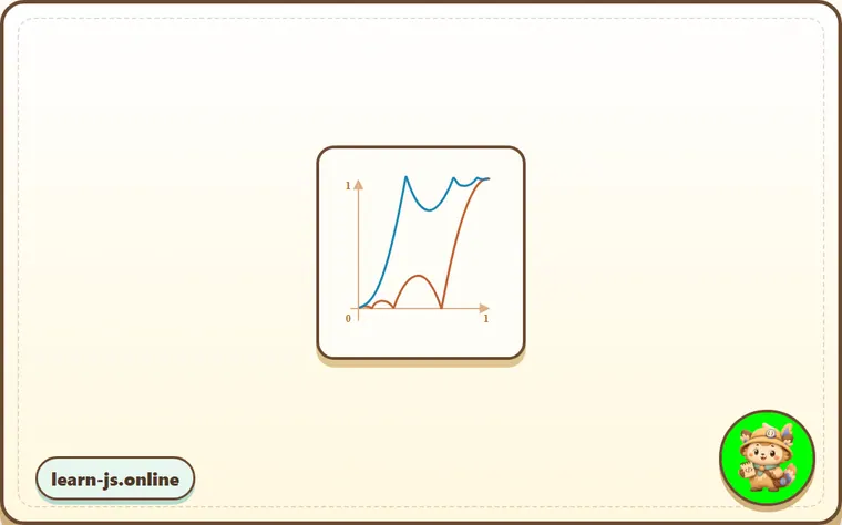
If there’s an animation effect in the beginning, like bouncing – it will be shown at the end.
In the graph above the regular bounce has the red color, and the easeOut bounce is blue.
- Regular bounce – the object bounces at the bottom, then at the end sharply jumps to the top.
- After
easeOut– it first jumps to the top, then bounces there.
easeInOut
We also can show the effect both in the beginning and the end of the animation. The transform is called “easeInOut”.
Given the timing function, we calculate the animation state like this:
if (timeFraction <= 0.5) { // first half of the animation
  return timing(2 * timeFraction) / 2;
} else { // second half of the animation
  return (2 - timing(2 * (1 - timeFraction))) / 2;
}
The wrapper code:
function makeEaseInOut(timing) {
  return function(timeFraction) {
    if (timeFraction < .5)
      return timing(2 * timeFraction) / 2;
    else
      return (2 - timing(2 * (1 - timeFraction))) / 2;
  }
}

bounceEaseInOut = makeEaseInOut(bounce);
In action, bounceEaseInOut:
Result
style.css
index.html
open in a new windowedit in the sandbox
#brick {
  width: 40px;
  height: 20px;
  background: #EE6B47;
  position: relative;
  cursor: pointer;
}

#path {
  outline: 1px solid #E8C48E;
  width: 540px;
  height: 20px;
}
<!DOCTYPE HTML>
<html>

<head>
  <meta charset="utf-8">
  <link rel="stylesheet" href="style.css">
  <script src="https://js.cx/libs/animate.js"></script>
</head>

<body>


  <div id="path">
    <div id="brick"></div>
  </div>

  <script>
    function makeEaseInOut(timing) {
      return function(timeFraction) {
        if (timeFraction < .5)
          return timing(2 * timeFraction) / 2;
        else
          return (2 - timing(2 * (1 - timeFraction))) / 2;
      }
    }


    function bounce(timeFraction) {
      for (let a = 0, b = 1; 1; a += b, b /= 2) {
        if (timeFraction >= (7 - 4 * a) / 11) {
          return -Math.pow((11 - 6 * a - 11 * timeFraction) / 4, 2) + Math.pow(b, 2)
        }
      }
    }

    let bounceEaseInOut = makeEaseInOut(bounce);

    brick.onclick = function() {
      animate({
        duration: 3000,
        timing: bounceEaseInOut,
        draw: function(progress) {
          brick.style.left = progress * 500 + 'px';
        }
      });
    };
  </script>


</body>

</html>
The “easeInOut” transform joins two graphs into one: easeIn (regular) for the first half of the animation and easeOut (reversed) – for the second part.
The effect is clearly seen if we compare the graphs of easeIn, easeOut and easeInOut of the circ timing function:
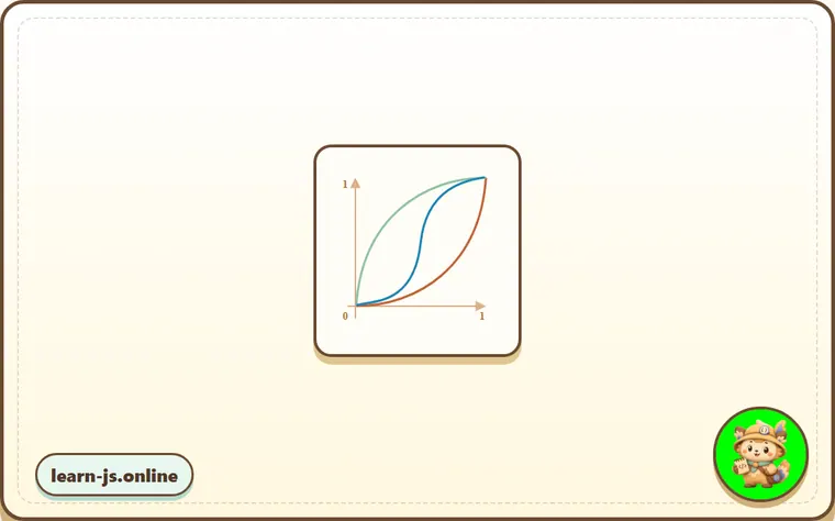
- Red is the regular variant of
circ(easeIn). - Green –
easeOut. - Blue –
easeInOut.
As we can see, the graph of the first half of the animation is the scaled down easeIn, and the second half is the scaled down easeOut. As a result, the animation starts and finishes with the same effect.
More interesting “draw”
Instead of moving the element we can do something else. All we need is to write the proper draw.
Here’s the animated “bouncing” text typing:
Result
style.css
index.html
open in a new windowedit in the sandbox
Run the animated typing!
textarea {
  display: block;
  border: 1px solid #BBB;
  color: #444;
  font-size: 110%;
}

button {
  margin-top: 10px;
}
<!DOCTYPE HTML>
<html>

<head>
  <meta charset="utf-8">
  <link rel="stylesheet" href="style.css">
  <script src="https://js.cx/libs/animate.js"></script>
</head>

<body>


  <textarea id="textExample" rows="5" cols="60">He took his vorpal sword in hand:
Long time the manxome foe he sought—
So rested he by the Tumtum tree,
And stood awhile in thought.
  </textarea>

  <button onclick="animateText(textExample)">Run the animated typing!</button>

  <script>
    function animateText(textArea) {
      let text = textArea.value;
      let to = text.length,
        from = 0;

      animate({
        duration: 5000,
        timing: bounce,
        draw: function(progress) {
          let result = (to - from) * progress + from;
          textArea.value = text.slice(0, Math.ceil(result))
        }
      });
    }


    function bounce(timeFraction) {
      for (let a = 0, b = 1; 1; a += b, b /= 2) {
        if (timeFraction >= (7 - 4 * a) / 11) {
          return -Math.pow((11 - 6 * a - 11 * timeFraction) / 4, 2) + Math.pow(b, 2)
        }
      }
    }
  </script>


</body>

</html>
Common mistakes
- Skipping the small examples and then missing the exact rule that JavaScript animations depends on.
- Copying code without changing one value at a time to see which part controls the result.
- Treating similar-looking syntax or APIs as interchangeable before checking their edge cases.
Summary
For animations that CSS can’t handle well, or those that need tight control, JavaScript can help. JavaScript animations should be implemented via requestAnimationFrame. That built-in method allows to setup a callback function to run when the browser will be preparing a repaint. Usually that’s very soon, but the exact time depends on the browser.
When a page is in the background, there are no repaints at all, so the callback won’t run: the animation will be suspended and won’t consume resources. That’s great.
Here’s the helper animate function to setup most animations:
function animate({timing, draw, duration}) {

  let start = performance.now();

  requestAnimationFrame(function animate(time) {
    // timeFraction goes from 0 to 1
    let timeFraction = (time - start) / duration;
    if (timeFraction > 1) timeFraction = 1;

    // calculate the current animation state
    let progress = timing(timeFraction);

    draw(progress); // draw it

    if (timeFraction < 1) {
      requestAnimationFrame(animate);
    }

  });
}
Options:
duration– the total animation time in ms.timing– the function to calculate animation progress. Gets a time fraction from 0 to 1, returns the animation progress, usually from 0 to 1.draw– the function to draw the animation.
Surely we could improve it, add more bells and whistles, but JavaScript animations are not applied on a daily basis. They are used to do something interesting and non-standard. So you’d want to add the features that you need when you need them.
JavaScript animations can use any timing function. We covered a lot of examples and transformations to make them even more versatile. Unlike CSS, we are not limited to Bezier curves here.
The same is true about draw: we can animate anything, not just CSS properties.
Predict
Before running this JavaScript animation model, predict the five output lines. It models requestAnimationFrame style timing, clamping timeFraction to 1, separating timing from draw, and wrapping a timing function with easeOut.
Reveal explanation
setInterval(..., 20) aims for about 50 frames per second, but requestAnimationFrame lets the browser choose frame times. The quad timing turns 25% time into about 6% progress and 50% time into 25% progress, then the animation clamps at 100% and stops before the extra 1250ms frame is drawn. easeOut reverses the timing shape, so 0.25 time already reaches about 44%. The text example shows that draw can update anything, not just CSS properties.
Try it
Replace timing: quad with timing: easeOutQuad, then predict the rafDraws line. Then change the duration to 500 and decide which frame becomes the final one.
Practice
- Rewrite one example from this lesson without looking at the original, then run it and compare the result.
- Change one input, operator, method call, or option in a code sample and predict what will happen before running it.
- Explain JavaScript animations in your own words as if you were reviewing it with another learner.
Keep learning
Continue with From the orbital height when you are ready for the next lesson.